
Check out Banowetz + Company’s latest branding project for Tyrrell Boruff, a family-owned asset management and operating company. A custom icon was created by merging the first letters of the company name, which is a combination of the wife’s maiden name and the husband’s family name. The use of lowercase typography gives the brand a friendly and approachable feel, while corporate blue tones add a level of professionalism. Collateral pieces were letterpress printed by Lilco, and edge painting ensures a great first impression.


Design that Rises Above the Rest: Flying Canvas Productions

When beginning a creative project, a blank canvas is a great place to start. That’s exactly the idea behind our logo for Flying Canvas, an “Artisan Video Marketing” production company that’s equal parts left-brained analysis and right-brained creativity. Emphasizing how Flying Canvas is able to produce a multitude of solutions from a clean slate, Banowetz + Company developed a mark that is sleek and open-ended, featuring interchangeable artwork in the mark to illustrate the uniqueness of every project. A series of icons was produced highlighting Flying Canvas' step-by-step process, which begins with thorough discovery and results in engaging storytelling. B+C produced two business card layouts, a clean, sophisticated option for everyday needs and a second, oversized option with more "wow factor." We are excited to see the Flying Canvas brand take off.


— Team Banowetz
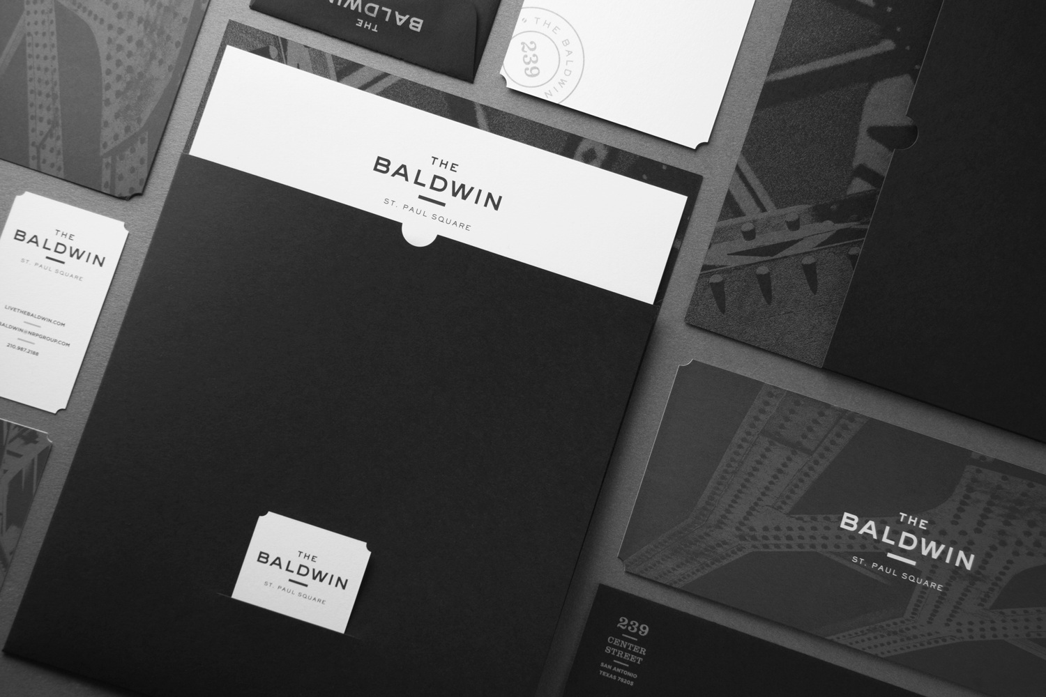
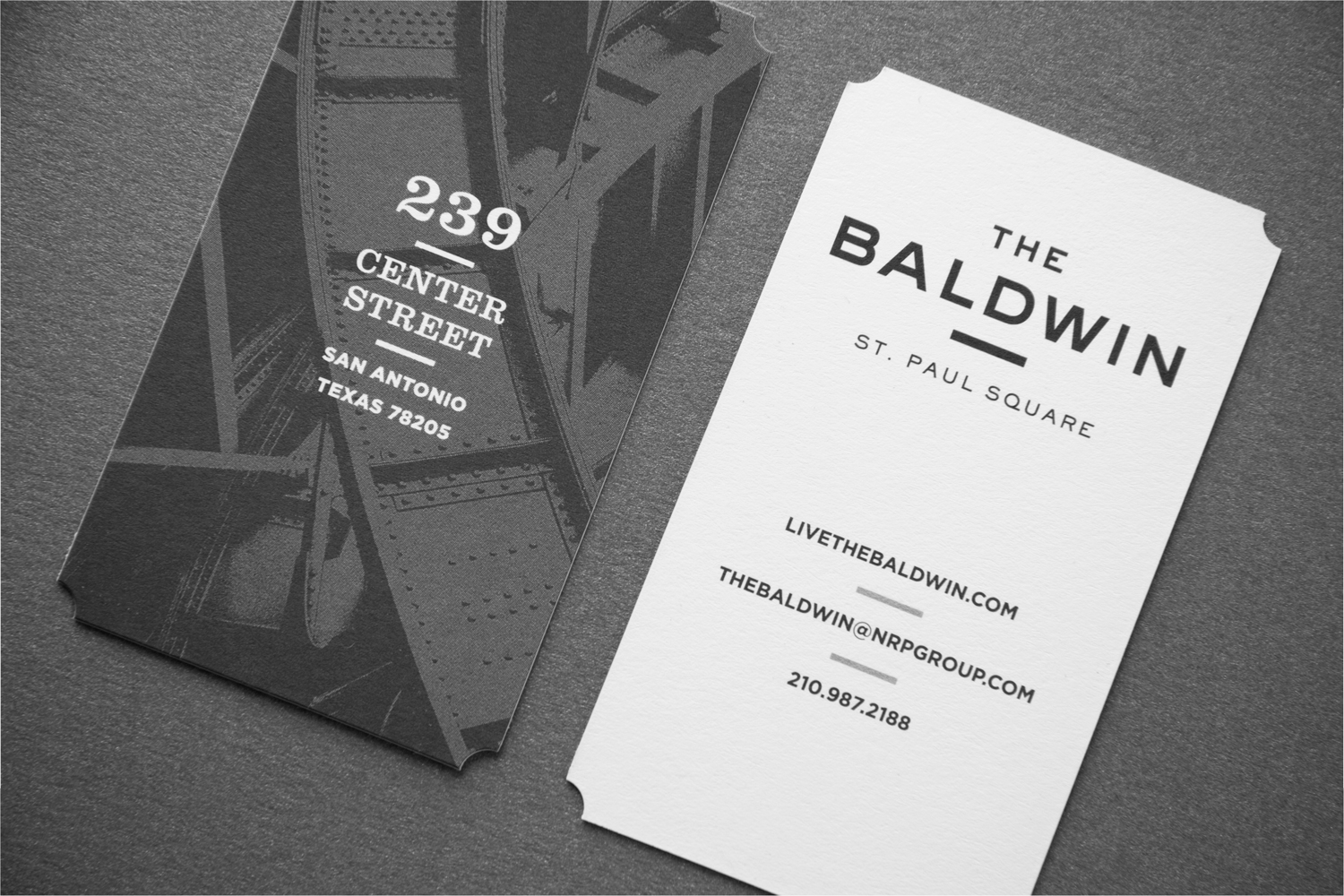
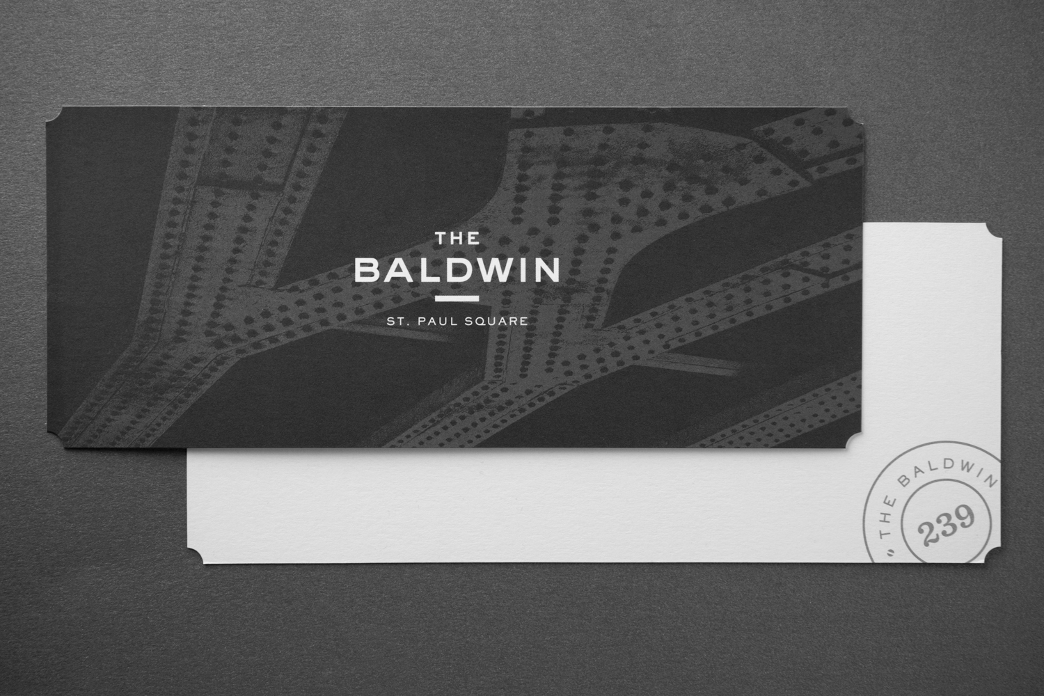
All Aboard, The Baldwin! New Work for The NRP Group

Banowetz + Company, Inc. recently completed a branding package for The NRP Group’s latest residential development, The Baldwin. Situated near the historic St. Paul Square and Sunset Station in San Antonio, Texas, the property brings together features of the building’s original brick façade, industrial loft-style spaces, and the spirit of the neighboring railroad junction. Inspired by these elements, we designed a logo system that is strong, modern, and rooted in railcar heritage, with wide sans-serif typography and stamp-like secondary marks. The business collateral incorporates black and white paper stocks, metallic inks, and duotone train and railroad imagery. These components come together to accentuate the history of the area and embrace the contemporary vision of the property.


— Team Banowetz