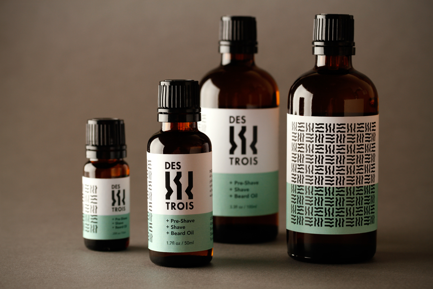
As part of the launch of a new personal care product line, Banowetz + Company just designed a logo and packaging labels for Des Trois, which translated means “of the three.” The client wanted branding that would not only appeal to both genders, but also feel very sexy and sensual, implying two’s company, three’s a... well, we’ll leave the rest to your imagination. Sneak a peek at the final mark below — a cleverly abstracted representation of three figures, which when intermixed both standing and lying down, form an attractively playful pattern.
— Team Banowetz


